By Stephen Hennessey
It has been a common debate at 19th holes across the country for decades: Which golf club has the best logo? Is it Augusta National? Merion? How about Oakmont or National Golf Links? It’s a somewhat subjective question, but a fun one to discuss.
PGA Tour pro Zac Blair, with the help of his buddy Andy Johnson at Fried Egg Golf, a website that covers golf-course design and contributes intelligent debate to other topics in golf, polled their social-media followers to determine the best logo in golf. The winner? Merion Golf Club.
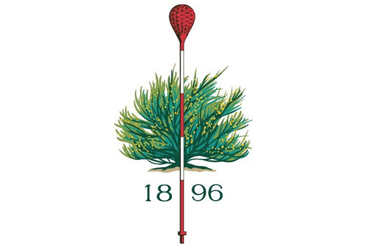
Your 2018 #LogoMadness Champion is …. the iconic wicker basket & scotch broom from Merion Golf Club! They took down Winged Foot Golf Club in the championship match. pic.twitter.com/CDnLzUiGvN
— Zac Blair (@z_blair) March 2, 2018
Most serious golfers know Merion’s iconic wicker-basket flagsticks, showcased in its logo, serve as pins at the East Course, whose rich history most famously includes Bobby Jones clinching the Grand Slam on its 11th hole at the 1930 U.S. Amateur. And they’ve done so since 1915, when designer William Flynn, who helped Philadelphia’s Hugh Wilson lay out the 126-acre design on the Main Line of Philadelphia, patented them. The USGA swapped out the wicker baskets for conventional flagsticks in 1950, but has known better not to mess with Merion’s trademark since.
It was probably not an upset for Merion to win this inaugural “Logo Madness,” as Blair dubbed it, as Merion has been known for its logo for almost 100 years. But Merion beat some of golf’s other legendary seals—eventually taking down another Northeast powerhouse, Winged Foot Golf Club, and its ultra clever but classy logo in the finals.
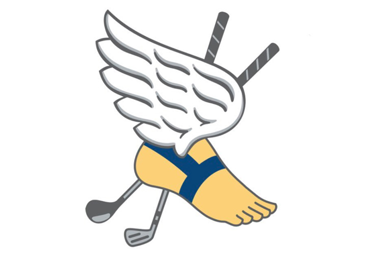
Winged Foot also has a rich championship history that links the legends of the game to its club. And its logo is equally as synonymous with the club as Merion’s is, although the club’s winged-foot emblem is an adaptation from the New York Athletic Club.
The Final Four included two other classics: Alister MacKenzie’s Pasatiempo Golf Club in Santa Cruz, Calif., a public-access facility, and Sleepy Hollow Golf Club in Briarcliff Manor, N.Y., designed by C.B. MacDonald and Seth Raynor in 1914, then worked on by A.W. Tillinghast, which edged out another tremendous seal—the whale of Maidstone.
In @the_fried_egg #LogoMadness 3rd place match we have Sleepy Hollow vs. Pasatiempo pic.twitter.com/YVpbE6392v
— Zac Blair (@z_blair) March 1, 2018
Here’s Maidstone’s logo … how great is that? Deserving of its No. 1 seed in this bracket, but getting taken down by another history-laden New York layout in Sleepy Hollow and the headless horseman.
https://www.instagram.com/p/Bfi3vUrh9J0/?utm_source=ig_embed
Some other fantastic logos that might not have gotten their due in this contest: McArthur Golf Club’s milkjug logo, Chicago Golf Club’s famous Far & Sure logo and Olympic Club’s winged logo.
Some of our favourites:
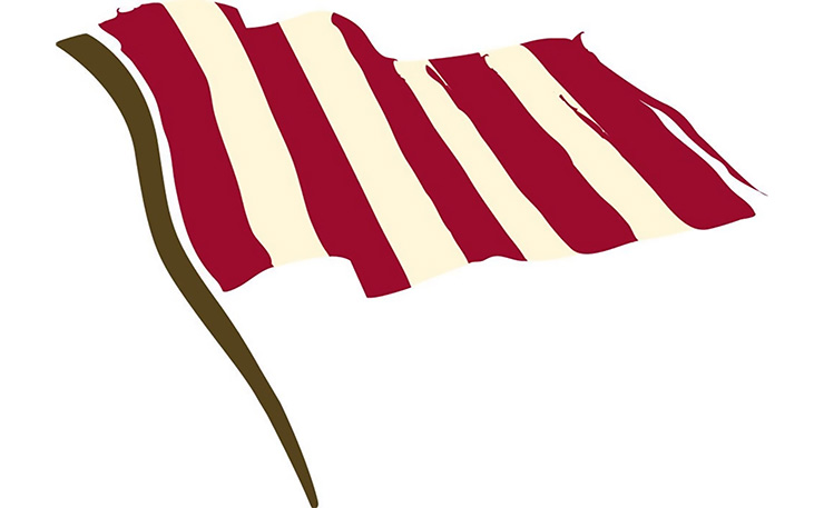
Boston Golf Club, with an ode to its city’s history, got the boot after the round of 32—after its unfortunate match-up against Olympic Club’s also awesome logo.
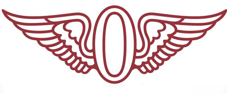
Olympic Club, with an obvious connection to its athletic-club history.
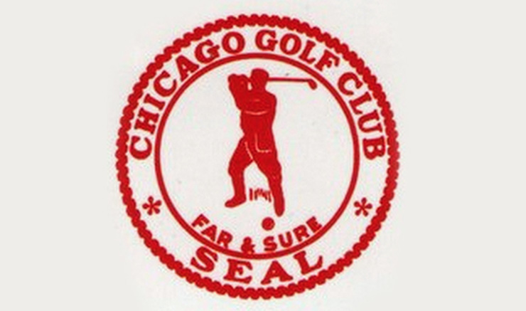
Chicago Golf Club also suffered a tough fate—losing to The Golf Club in Ohio’s logo in the first round. We think it’s one of the most recognizable and historic emblems in golf.
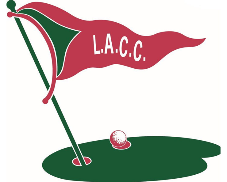
Los Angeles Country Club’s logo is pretty unique within golf. But its spot in the bracket meant an early exit after a defeat by Sleepy Hollow in the second round.
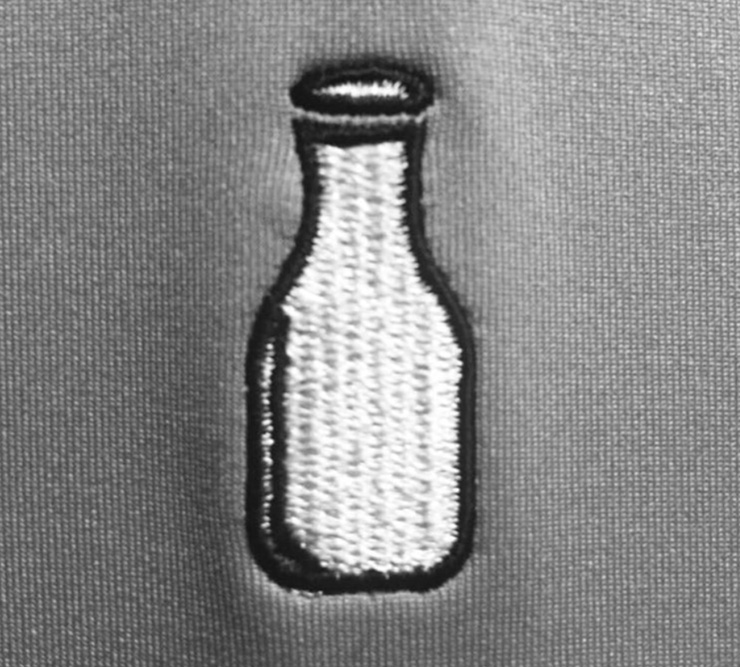
The aforementioned McArthur Golf Club in Hobe Sound, Fla.
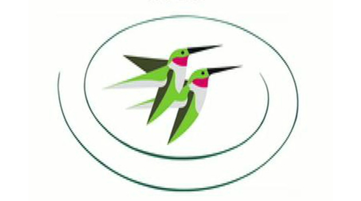
And how about Castle Pines—the 100 Greatest club in Colorado didn’t even make this 64-logo field! Those birds belonged in the field, for sure.

